When you step into a beautiful home in Manhattan, the first impression often comes from the colors that surround you. Walls, ceilings, trims, and finishes all create a subtle but powerful effect that defines how the space feels. The right color can make a space feel airy and expansive, while the wrong tone can make even a roomy loft seem confined. Choosing paint is about much more than a simple stylistic preference; it’s about understanding the science of color and how it interacts with natural light, architecture, and lifestyle.
You may wonder why color decisions are so challenging. The answer lies in the way tones shift under different lighting, how undertones influence perception, and how colors interact with furniture and finishes. When chosen thoughtfully, paint tones don’t just add beauty; they elevate the entire atmosphere of your living space.
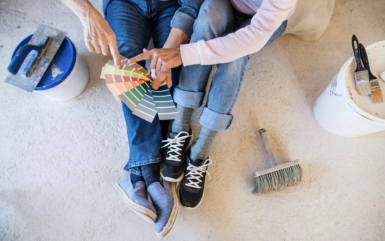
The Psychology Of Color In Your Home
Color has an undeniable psychological effect. Soft blues can calm the mind after a hectic day, while rich burgundy tones can add sophistication for entertaining. The choices you make for each room should support the purpose of that space, whether it’s rest, productivity, or celebration.
Cooler shades, such as gray-blues or muted greens, often create a soothing environment, which is why they work well in bedrooms or spa-inspired bathrooms. Warmer tones — think terracotta, cream, or golden beige — tend to invite energy and warmth, perfect for kitchens and dining areas where conversation and connection happen.
Luxury design is about curating experiences. A deep charcoal office may inspire focus and confidence, while a sunlit living room in pale ivory feels open and welcoming. When you think about paint choices, ask yourself what mood you want to create in each space.
How Natural Light Shapes Color
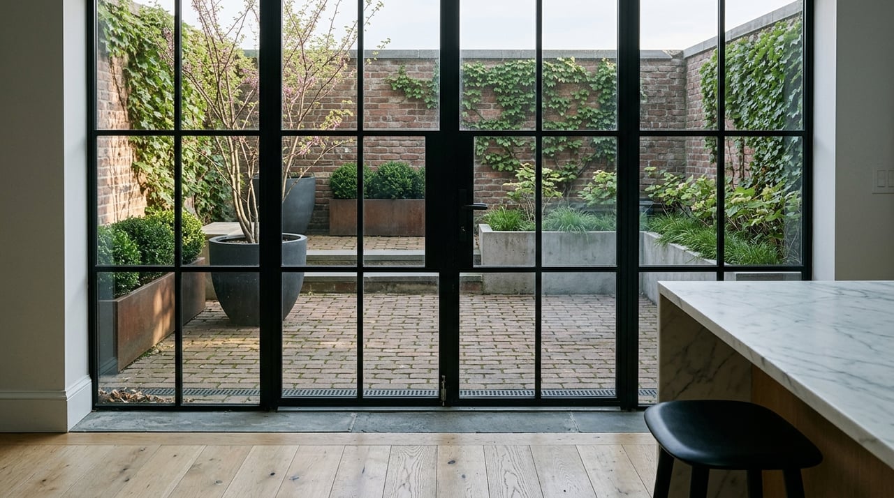
One of the most overlooked aspects of paint selection is light, which behaves differently depending on the orientation of your home, the height of your building, and even reflections. A south-facing home may be bathed in warm daylight, intensifying reds and yellows, while a north-facing loft might lean cooler, bringing out the gray undertones in white paint.
Morning light tends to soften tones, while afternoon sun intensifies the vibrancy. Evening light can alter how colors look once artificial lighting takes over. This is why designers recommend testing swatches at different times of the day. A color that feels perfect at noon might look entirely different after sunset.
For luxury properties in Manhattan with expansive windows, the skyline often becomes part of the palette. Cool grays or taupes may highlight sweeping views of the landscape, while creamy neutrals can balance a panorama of brick and steel. Light and paint work hand in hand, so considering this relationship is essential before finalizing your color palette.
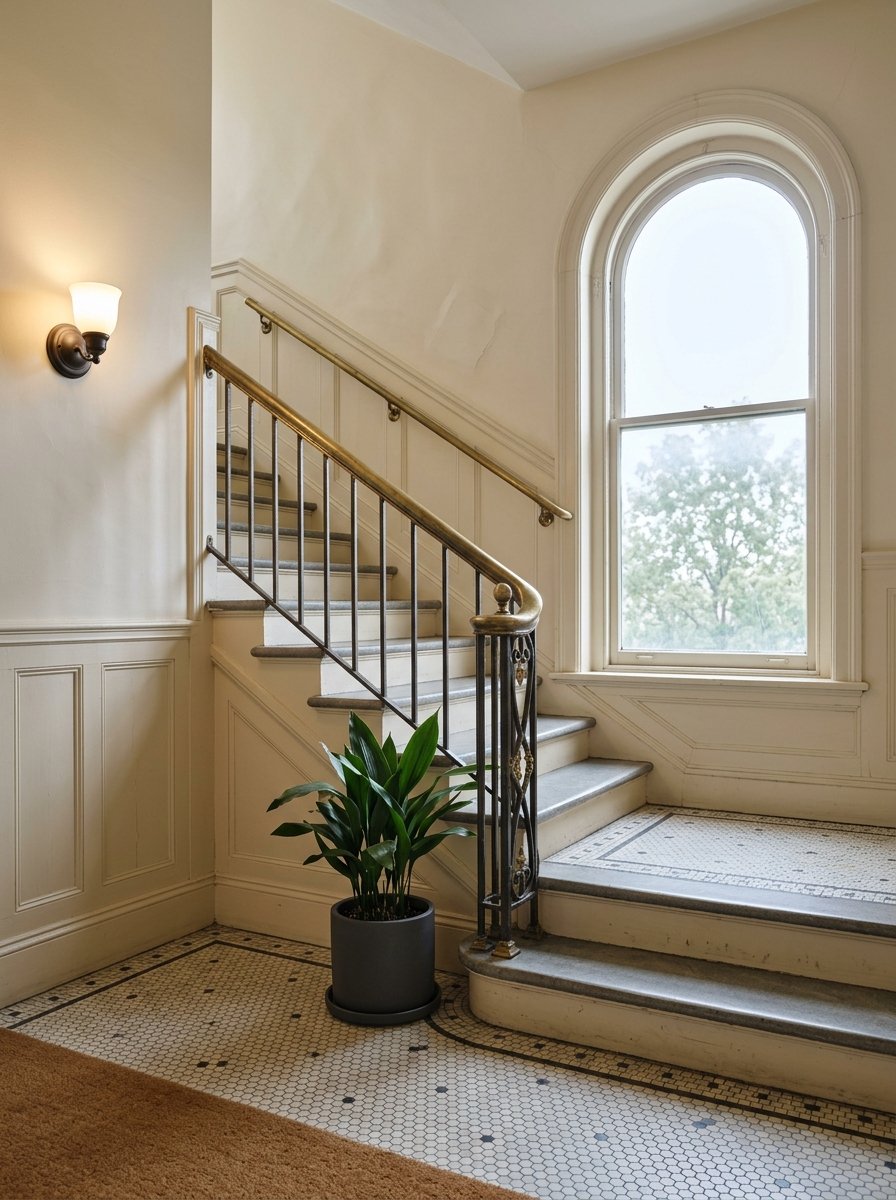
Undertones And Why They Matter
Paint colors are rarely as straightforward as they appear on a swatch. A “simple” gray may carry green, blue, or purple undertones that shift depending on the light or furnishings. In high-end design, undertones are crucial because they determine whether a color feels harmonious or jarring in the overall scheme.
For example, pairing a warm beige with a cooler gray can make one or both look mismatched. On the other hand, layering a gray with subtle blue undertones alongside navy accents creates a seamless, intentional look. Understanding undertones helps you avoid mistakes and ensures cohesion throughout your Manhattan home.
One practical method is to compare colors directly on the wall rather than relying solely on swatches. Place large paint samples next to trim, flooring, and furniture. The undertones will quickly reveal themselves, and you’ll be able to see how they interact with your existing finishes. With this approach, every tone chosen feels deliberate and well-balanced.
The Role Of Neutrals In Luxury Design
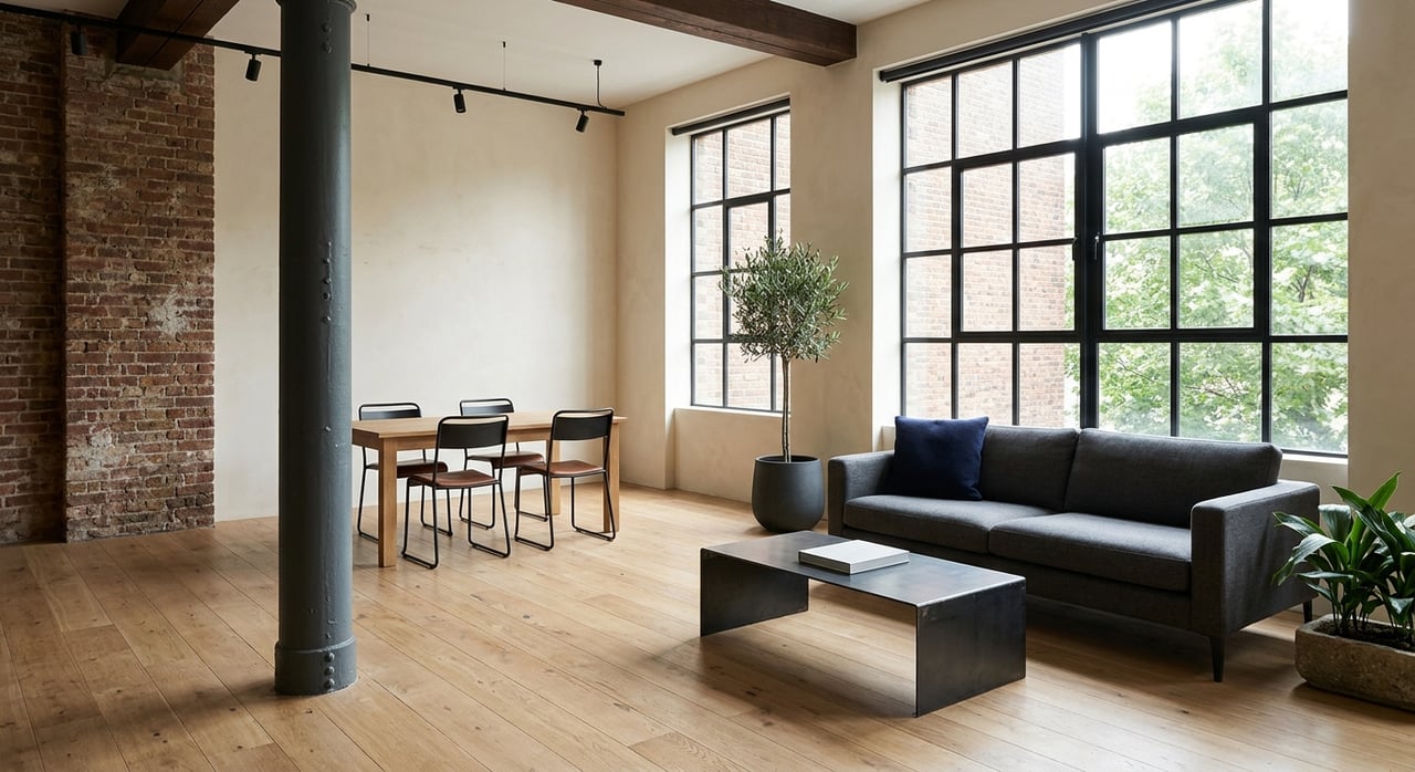
Neutrals form the foundation of many homes because they offer timeless appeal and flexibility. Interiors often rely on layered neutrals — soft whites, creamy ivories, taupes, and warm grays — that allow architectural features and views to shine.
Neutrals also act as a backdrop for artwork, designer furniture, or bold statement pieces. By choosing the right base, you can create a canvas that can evolve with your style. A pale beige may highlight marble flooring, while a soft gray complements sleek modern cabinetry. The beauty of neutrals lies in their ability to unify spaces while still allowing individuality in accents.
However, not all neutrals behave the same way. For instance, a cool-toned white might feel stark in a dim hallway, while a warmer shade softens the space. Thoughtful layering — using slightly different tones for walls, trim, and ceilings — adds depth and sophistication without overwhelming the room. When paired strategically, neutrals transform into a luxurious statement on their own.
Adding Depth With Accent Colors
Accent colors bring personality and drama to luxury spaces. While neutrals provide the base, bold shades add vibrancy and dimension. In your Manhattan home, accent walls or carefully chosen hues for built-ins, doors, or ceilings can create striking focal points.
Deep emerald or navy might be used in a library to convey richness, while soft blush or muted sage can warm up transitional areas like hallways. Accent tones don’t always need to be bold; sometimes, a slightly darker variation of your base color can create subtle elegance.
The key is balance. Overusing accents can overwhelm a space, while too few may leave it feeling flat. Incorporating accent tones in textiles, rugs, or artwork helps tie everything together, creating a layered look that feels curated and intentional. When executed thoughtfully, accent colors elevate the design and highlight your home’s unique features.
The Connection Between Color And Texture
Color never exists in isolation; it interacts with texture. The sheen of the paint, the finish of a surface, and the materials around it all impact how color reads. High-gloss paints reflect more light, adding vibrancy, while matte finishes absorb light for a softer effect.
Pairing warm paint tones with natural textures like wood or stone enhances warmth, while cooler tones alongside glass and metal emphasize sleekness. Carefully coordinating paint with textures ensures the design feels complete.
Texture also helps prevent monotony when working with a neutral palette. A white wall paired with glossy trim and matte cabinetry feels layered rather than flat. Understanding how color interacts with texture allows you to create visually dynamic spaces without overwhelming the senses.
Painting A Vision Of Luxury
In the end, color is one of the most powerful tools in luxury design, shaping perception, mood, and style. In Manhattan homes, where architecture and light are as unique as the setting itself, thoughtful paint choices can elevate every detail. From neutrals that provide timeless appeal to accents that bring personality, every tone has the potential to transform.
If you’re seeking the property of your dreams, The De Niro Team is ready to lead you to success in Manhattan real estate. Reach out today.
If you’re seeking the property of your dreams, The De Niro Team is ready to lead you to success in Manhattan real estate. Reach out today.